TUI tables in HTML
03/06/2025
I love the aesthetics of terminal UIs. I recently came across a tweet with a good example of pretty tables rendered in a terminal.
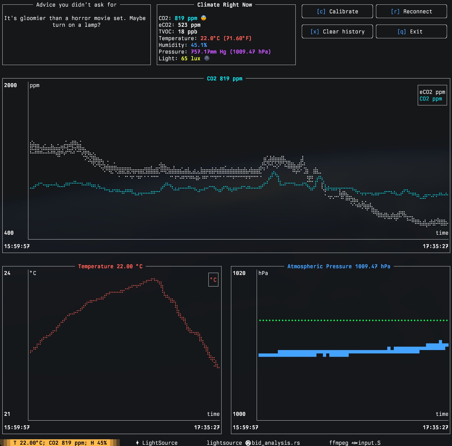
So how do you build this aesthetic for the web? Lets explore different approaches by trying to build the table on the top left corner.
Approach 1
I chanced upon this approach only after working on other approaches. But this is certainly the easiest way to build such tables. The solution is the <fieldset> tag.
code:
<fieldset class="table-wrapper">
  <legend>Advice you didn't ask for</legend>
  <div>It's gloomier than a horror movie set. Maybe turn on a lamp?</div>
</fieldset>
.table-wrapper {
background-color: black;
padding-bottom: 4rem;
max-width: 500px;
text-align: center;
}output:
This actually works great. But I’m not sure if this is semantically ok. Fieldsets are really only meant for grouping related elements in a form.
Approach 2
Lets manually build this visual.
- Create a div which will serve as the wrapper to both the table header and the content. Set
top-paddingto this element equal to half the height occupied by the header text. This will ensure that the overall box fits perfectly. This padding can be calculated from thefont-sizeandline-heightused by the table header. In the example I use css variables to show the calculations. - Use another div to make the table header. Use a combination of
flex: 1andheight: 1pxto generate the header divider which extends on both sides of the header title. Useposition: absoluteto position the table header on top of the content div. - Add a div which has the table content. The
top-paddingon the parent wrapper will ensure the content is perfectly positioned wrt the absolutely positioned header element. Add aborderto this div except thetop-borderwhich will be given by the header div from step 2. - Add
paddingand other styling to the content div if needed.
code:
<div class="table-wrapper">
  <div class="table-header">
    <div class="table-header-divider"></div>
    <div>Advice you didn't ask for</div>
    <div class="table-header-divider" style=""></div>
  </div>
  <div class="table-content">
    It's gloomier than a horror movie set. Maybe turn on a lamp?
  </div>
</div>
.table-wrapper {
--font-size: 1rem;
--line-height: 1.5;
font-size: var(--font-size);
line-height: var(--line-height);
max-width: 500px;
position: relative;
padding-top: calc(var(--font-size) * var(--line-height) / 2);
}
.table-header {
display: flex;
gap: 2px;
position: absolute;
top: 0;
left: 0;
right: 0;
}
.table-header-divider {
flex: 1;
align-self: center;
height: 1px;
background-color: white;
}
.table-content {
border: 1px solid white;
border-top: none;
padding: var(--font-size) 0.5rem 4.25rem 0.5rem;
background-color: black;
text-align: center;
}output:
This approach is definitely more painful. And it doesn’t behave like fieldset in all curcumstances. eg. a situation where the table header has to overflow. But it does give you a lot of flexibility.